Let’s talk about spreads.
A “spread” usually refers to the gap between two bond yields. By comparing the yields of two different categories of bonds, you can determine the risk premium (i.e., how much extra compensation an investor demands in the market for the riskier bond) that a particular bond holds.
When compared to the U.S. Treasury, analysts are typically comparing the yield of an asset to the so-called “risk-free rate”. That RFR is typically the baseline for what other assets can offer, and the typical RFR used is the yield on a U.S. Treasury bond, since a default of U.S. government bonds is considered the most impossible default out there.
When we start comparing the interest rate on AAA corporate bonds (i.e., the highest rated bonds issued by large companies) to the 10-year U.S. Treasury bond (i.e., the risk-free rate), we can get the risk premium required to invest in corporate bonds. We can then chart the spread between the two like this:
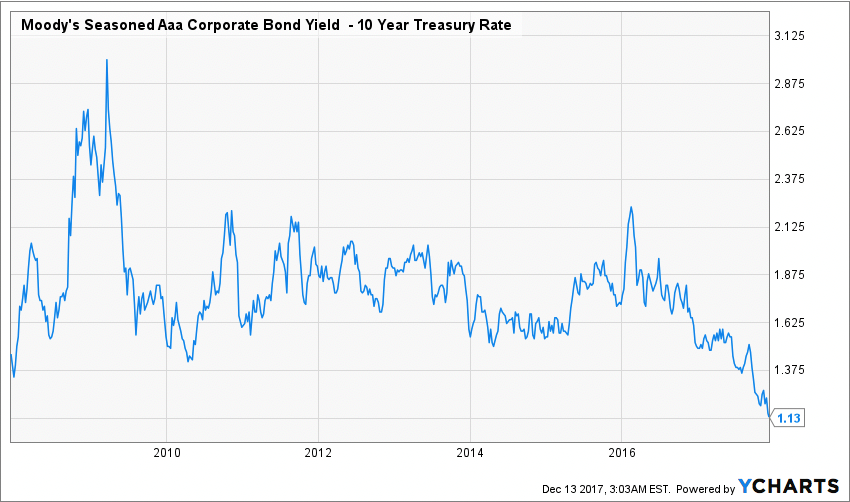
When we do this, an interesting pattern emerges. Back in 2008-2009 during the financial crisis, the spread soared by more than 100%. The market was nervous, bank defaults were a real threat, and the broader world economy plunged into recession. The U.S. was in such a deep mess that unemployed soared to near 10% and many serious economists talked about the end of civilization as we knew it. Young people today aren’t aware of just how bad that crisis was; it was very bad.
But then things started to get better very slowly. First in 2009 there was TARP and other stimulative policies from both the U.S. government and Federal Reserve, and those
moves calmed nerves and helped the risk premium fall. The economy slowly recovered throughout the 2010’s, but never really showed signs of significant strength until very recently—when the risk premium started to fall significantly.
That isn’t to say the risk premium has fallen to its lowest point in history. Look at this chart:

If we go back further to compare things to the 1990s and 2000s, we see that the risk premium is in the “normal” range and not as low as it got during the heady days of the housing bubble, when marketwide optimism caused a lot of aggressive risk taking. That risk taking is reflected in the <1 risk premium bond buyers saught in the mid-2000s. Similar enthusiasm in the “yuppie” 1980’s caused a similar dip.
There’s a lot more analysis we could do with this and other charts, but the point is that the risk premium as expressed in the spread between a bond category and the risk-free rate is economically and financially meaningful. It is a manifestation of the animal spirits in the market and the prevailing attitude out there. Just by looking at the chart for 2007-2017 tells us that the market is extremely confident right now—more than it has been in a decade.
One more chart will explain where the confidence is coming from right now.
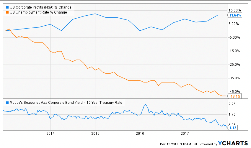
Here we see how the unemployment rate’s decline has continued downward in 2016-2017 while corporate profits have continued to increase. In 2015-2016 we had falling unemployment but stagnant corporate profits—not enough to cause the risk-free rate to fall. In 2013-2014 we saw both rising, which helped the risk-free rate fall a bit from its unusually high levels in 2008-2012, but not enough to bring it down significantly. Finally in the last 2 years we’ve had both be strong enough to bring that rate down further.
And that brings us to today. No one knows what’s in store for 2018, but the prevailing attitude in the bond market is very clear—it’s a story told by these charts. And it’s a story of optimism and enthusiasm backed up by macroeconomic tailwinds.